Hi there!
If you wish to contact me, you will find an email address at the end of the page.
If you are curious about the website itself, read on!

The drawing process
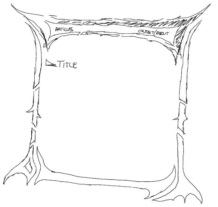
I drew the frame on a tablet, with Sketchbook, in black on white. No SVG was used, it is entirely hand drawn. I started with a quick sketch of the overall structure:

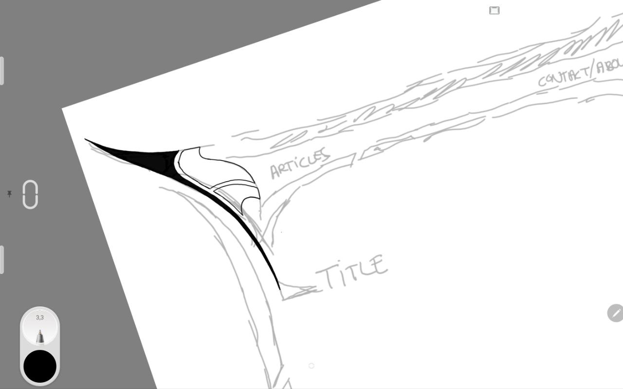
Then the actual drawing began, adding details on top of the sketch:

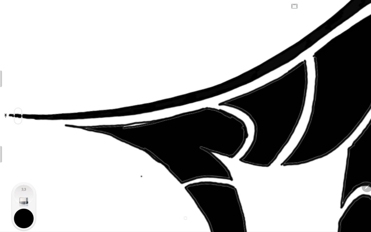
The whole drawing took approximately two days to ensure that all the edges look clean - zooming in and straightening edges. Drawing freehand, you realize how sloppy you are when you get a bit closer :D

After straightening it all out, it looks a lot better:

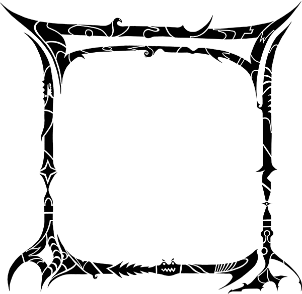
This is what the finished frame looked like before post-processing in Photoshop:

The cool thing with Sketchbook is that you can export your
drawing including all layers to a .psd file. Once I opened
this in Photoshop, I created the color scheme and added small
color accents here and there.

Converting it to HTML
To build the HTML, I created slices in Photoshop to export individual images. This is what the slice layout looks like:

There are two main images for the top and bottom, with a 1 pixel high image in the middle used to fill the space when the page stretches higher. I did not want to use a scrollbar inside the frame, to keep the navigation natural.

Downscaling images
One complication was the size of the images: The source image of the frame is over 3000 pixels wide. I kept the original size when exporting, to ensure that the quality of the edges is preserved by downscaling the images.
To get all the sizes right in the HTML, I am converting the
image pixel sizes to rem, using a base pixel size of
1px = 0.06rem (which corresponds roughly to a base
font size of 16px).
This works, because in modern browsers, there are no
pixel/integer values anymore in their internal calculations.
If you inspect the "Articles" navigation button for example,
you will see width and height values like 15.52rem. This
is all calculated on the fly server side, with a global
downscaling factor.
Incidentally, this makes the website work very well with the browser's zoom feature, as the downscaling is already a kind of inverted zoom. The quality of the images is great, even though they are not in SVG format.
You can play around with the downscaling factor by adding the parameter to any URL in the website (you can also use the downscaling UI in the top right of the frame):
&downscaling=1
This value accepts a float, and basically defines how much smaller the images should be rendered compared to their original size (higher values = smaller images).
- 0 = No downscaling (original size)
- 1 = Half size
- 2 = Two times smaller (default)
- 2.4 = Float value
- ...etc
The only issue with this is that hairline fractures will sometimes appear between images - these are rendering quirks in the browser, and can sadly not be prevented. The same can also happen in any website when using the browser's zoom feature.

Color themes
This is something I wanted to do since the start: Be able to switch between color schemes. The frame lends itself pretty well to different colors, so I wanted to explore this.
The theme can be switched using the three little icons in the top right of the frame. There are three themes:
- "Ghostly" (blue)
- "Gaia" (green)
- "Blaze" (red)

No cookies
This was very important - I did not want any cookies on the site whatsoever. Not even a session cookie. Instead, all user-specific settings like the theme are repeated in all site-internal links to persist them between pages.
You might wonder why I do not even use a session parameter in the URLs. There is a simple reason for this: I want the URLs to be shareable. If I start hiding things in a session, the URLs become useless once the session expires. As it stands, any page can be shared with all relevant settings.
Personally I find this quite liberating. Also, I don't mind the long ugly URLs. I am not trying to win any URL design contests :D
